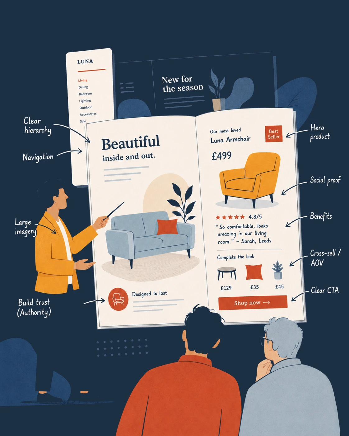
Take a look at your catalogue AFTER our sales optimisation
As part of our FREE demo, we will design at least 2 pages of your latest catalogue with direct response principles applied.
We've presented well over 100 free catalogue demos
Here are just a small selection of the before and after page optimisations we created as part of these presentations.

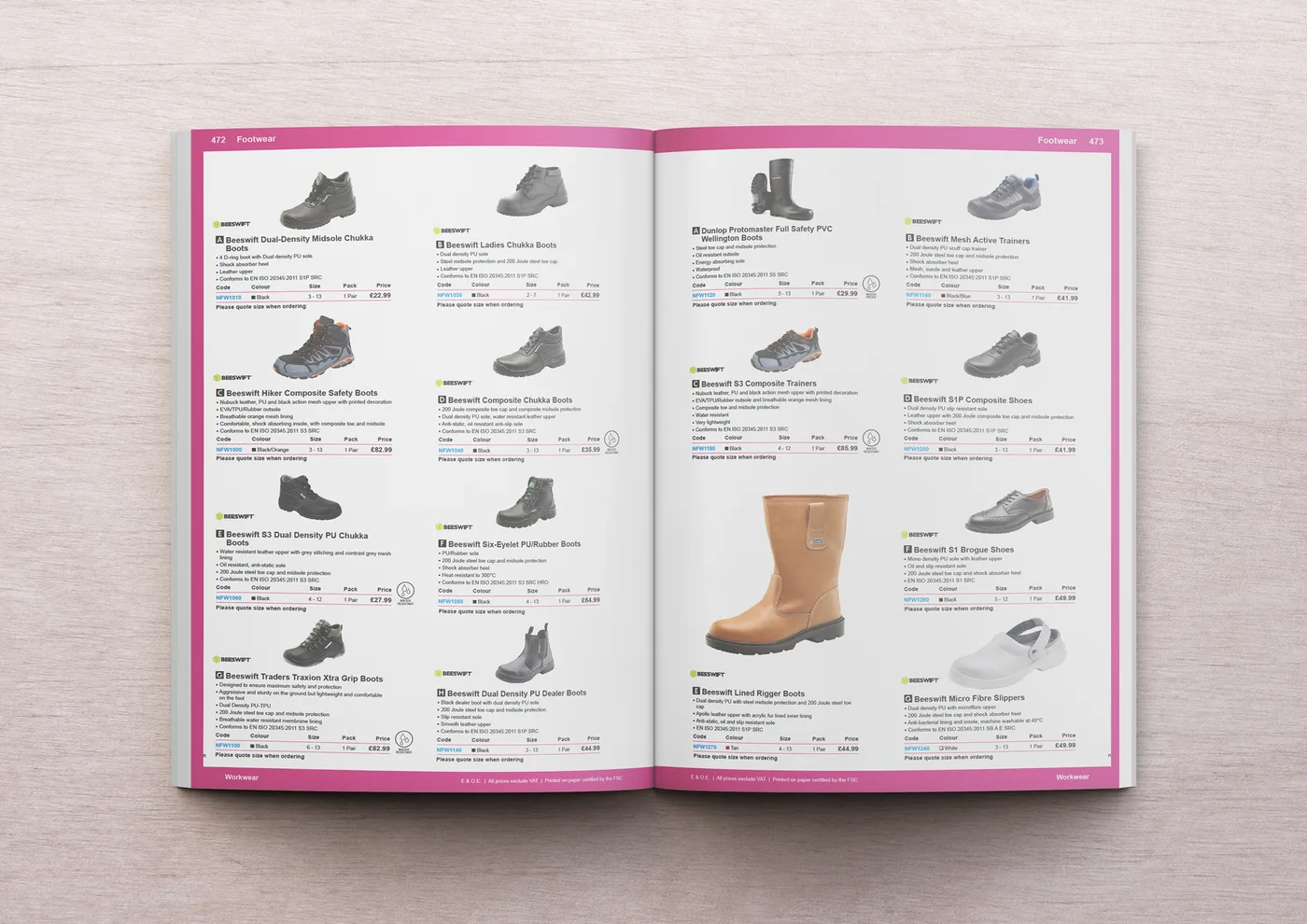 Before
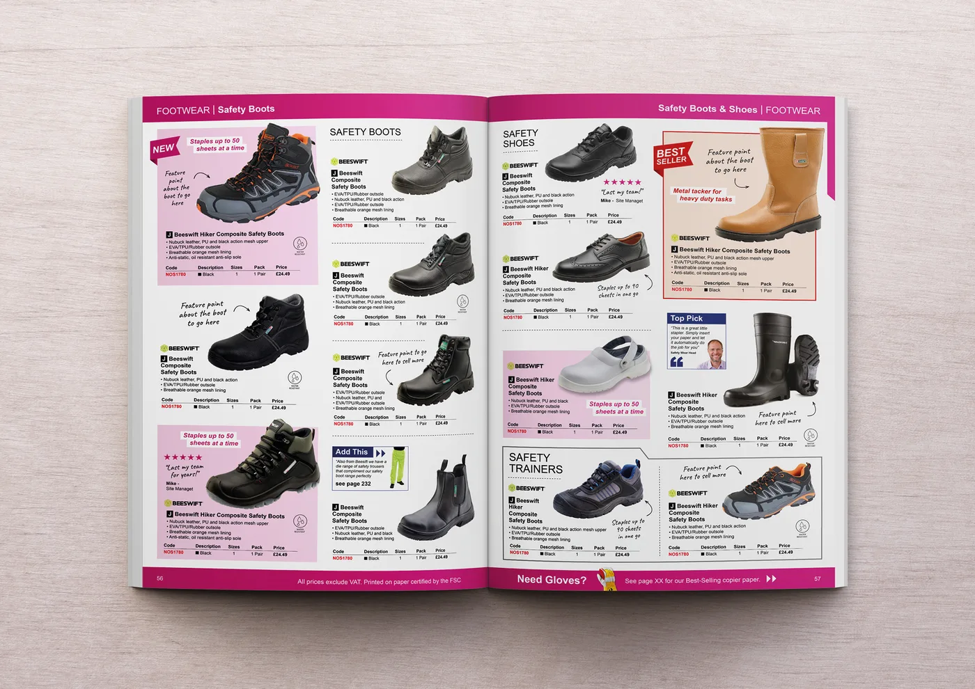 After
After“If you are thinking about taking the catalogue review from Paper & Pixels, I would say 100% go ahead! James and his team clearly know their stuff, the presentation is excellent and the insights they give are so valuable.”
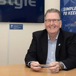 Tim BeaumontManaging Director, Nemo Office Club
- Re-structure to push high revenue products
- Increase image size throughout
- Introduce relevant cross sells to push up AOV
- Product reviews and feature points highlighted

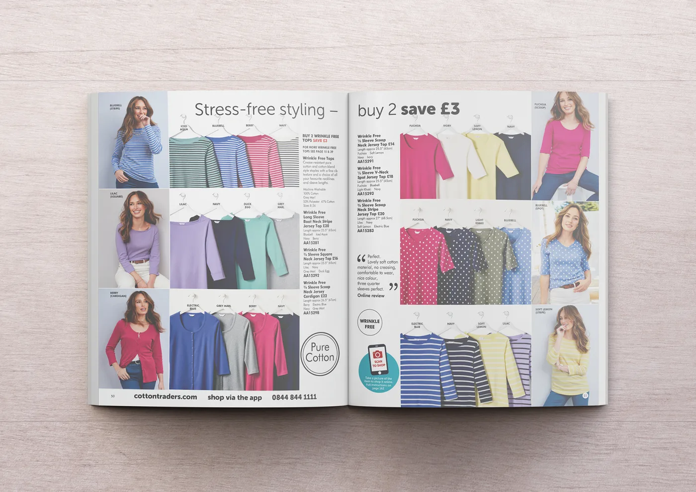 Before
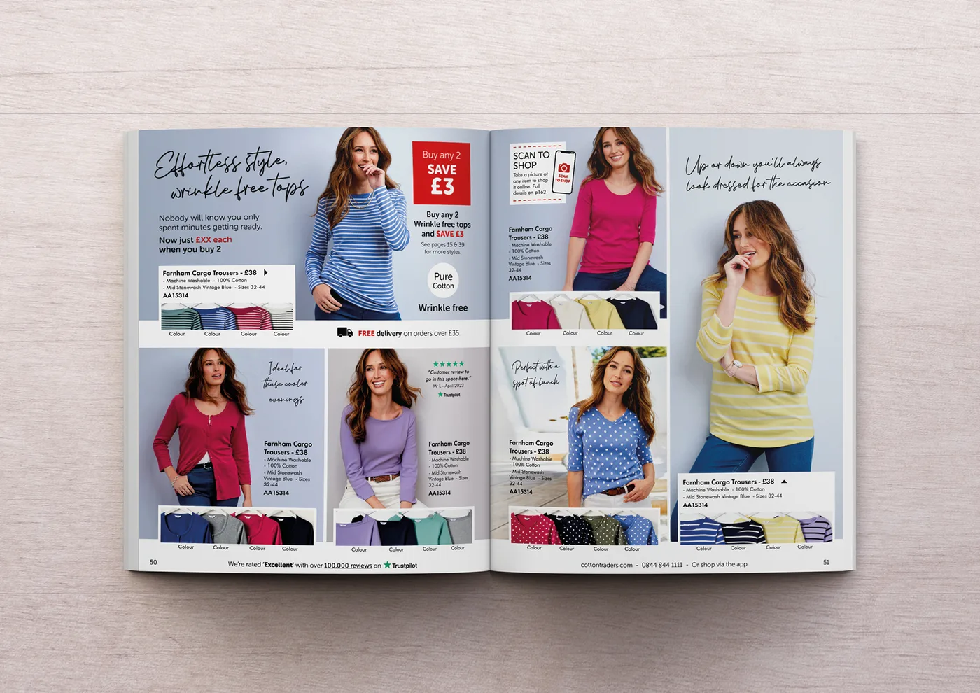 After
AfterGiving the page a clear hero product changed how the whole spread read — it finally looked like it was selling something.
 Shona JamesonChief Marketing Officer, Cotton Traders
- Introduced a dominant hero product per spread
- Rewrote headlines to lead with a clear benefit
- Added a reassurance panel near the call to action
- Simplified the product grid hierarchy

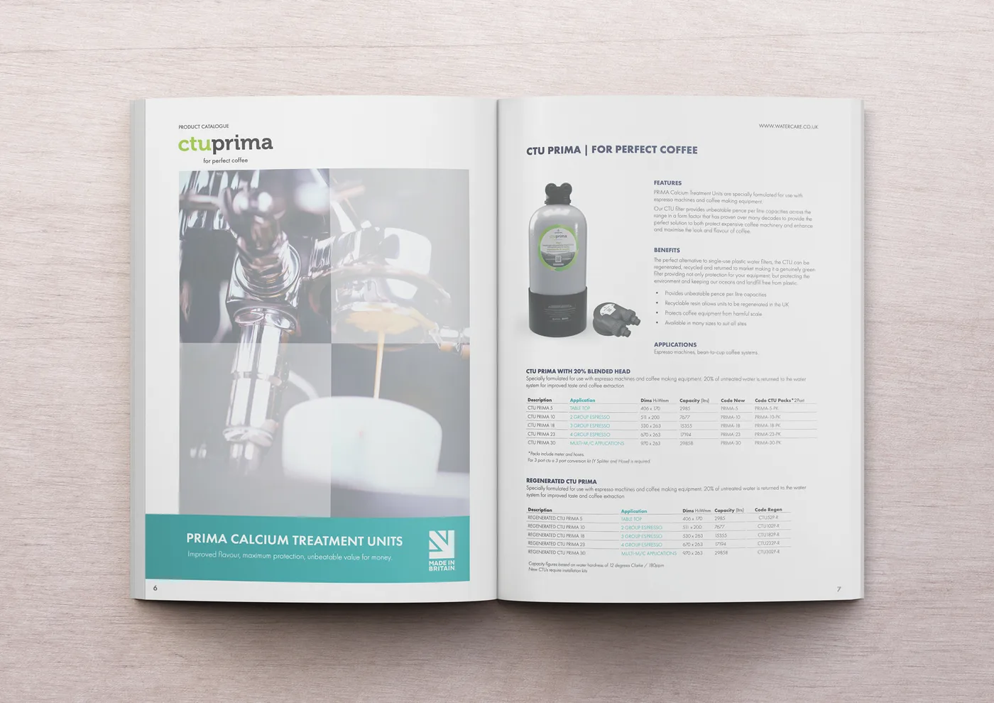 Before
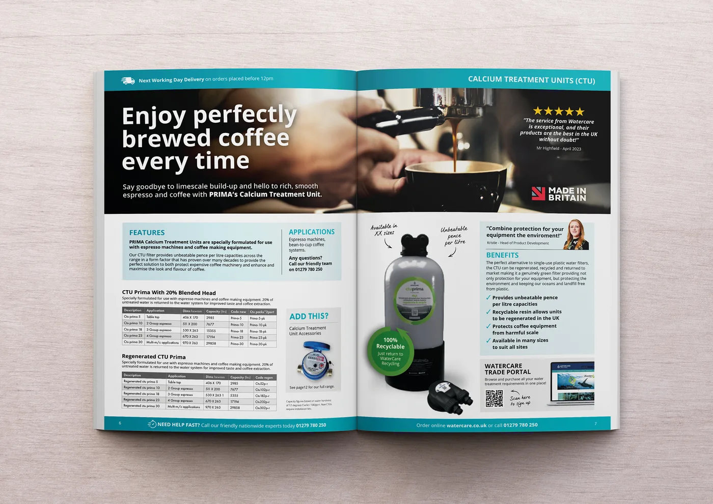 After
AfterTurning a technical listing into something that actually reads like a shoppable page was exactly what this range needed.
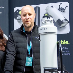 Andrew SlarkManaging Director, Watercare
- Rebuilt listings around clear, benefit-led copy
- Added a visible, findable call to action
- Turned technical jargon into shoppable language
- Introduced clearer visual hierarchy throughout
“If you are thinking about taking the catalogue review from Paper & Pixels, I would say 100% go ahead! James and his team clearly know their stuff, the presentation is excellent and the insights they give are so valuable.”

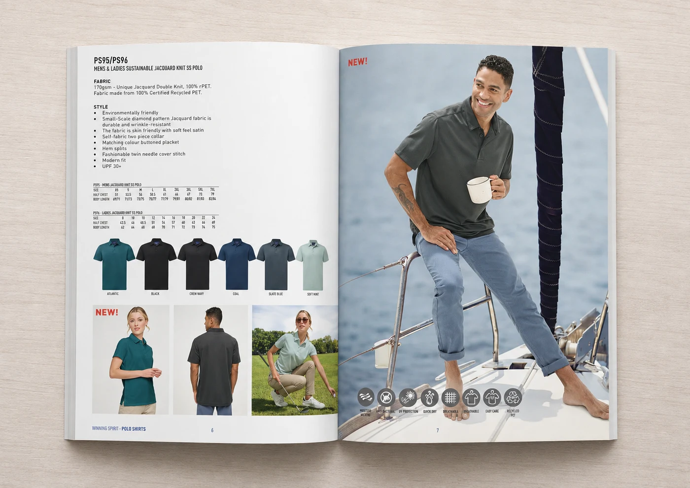 Before
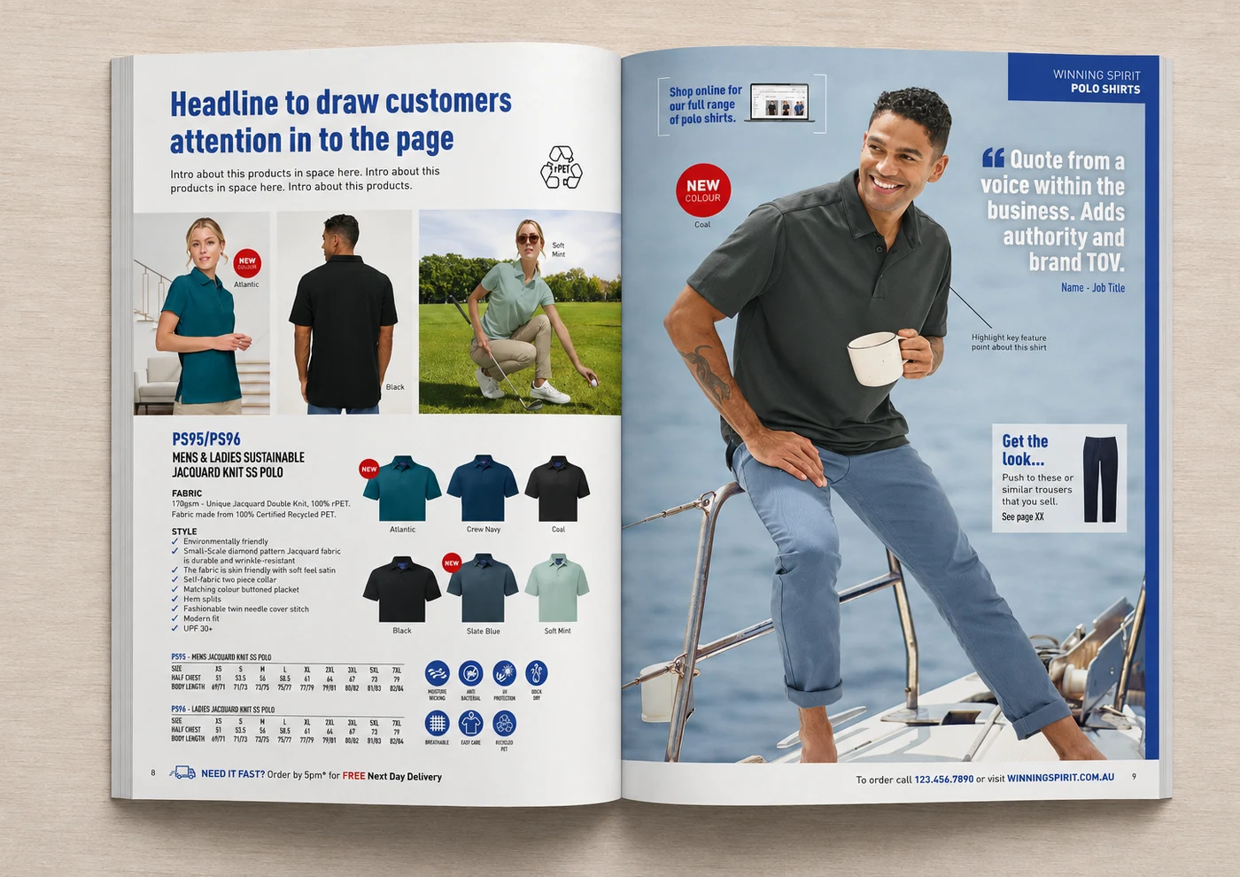 After
AfterAdding a proper headline and quote to the page gave it a voice — it doesn't just show the product now, it sells it.
 Arif KhanArt Director, Winning Spirit
- Added a benefit-led headline to open the page
- Introduced a customer quote for on-page authority
- Added a 'Get the look' cross-sell to lift AOV
- Highlighted key product features with clear callouts

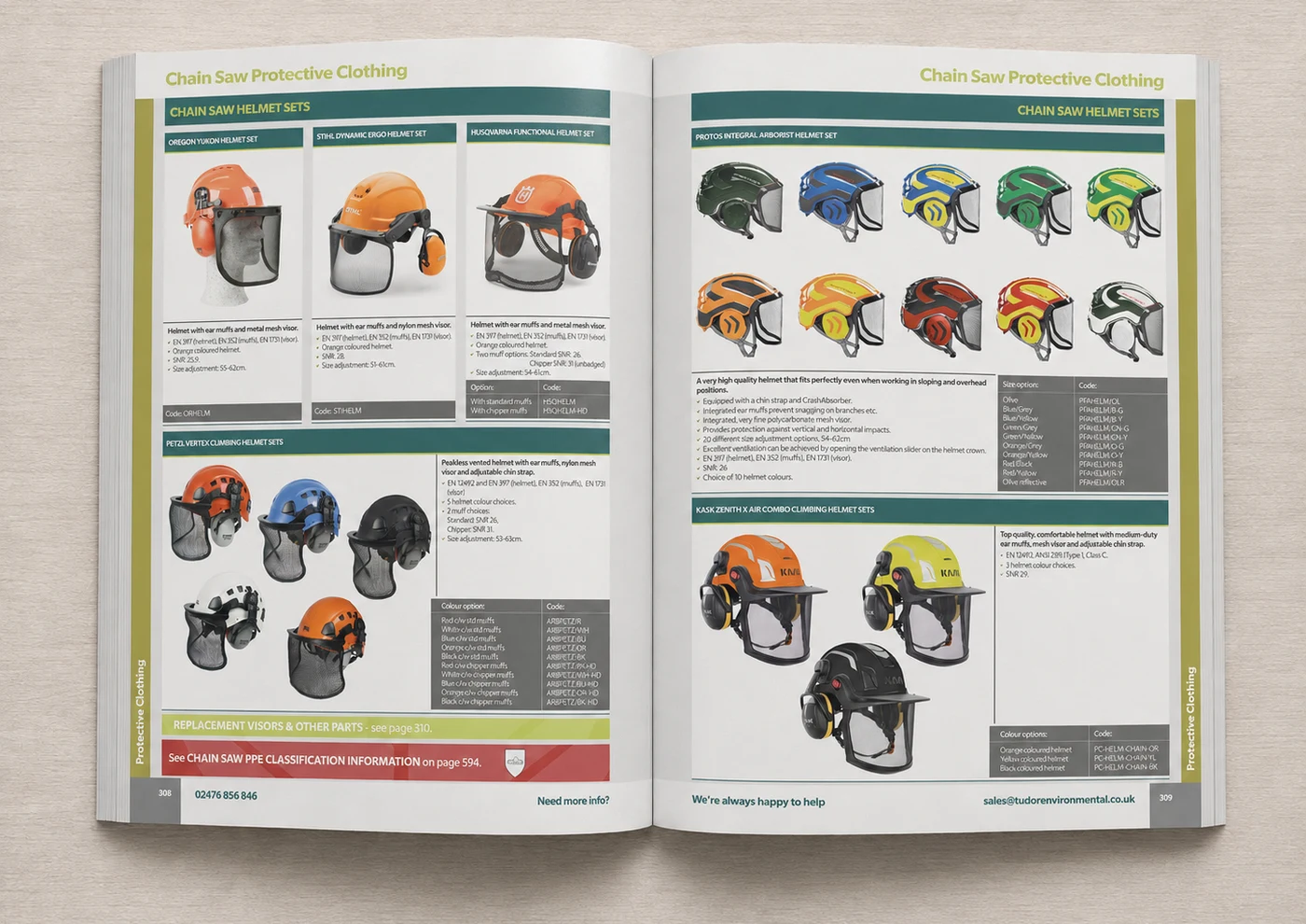 Before
 After
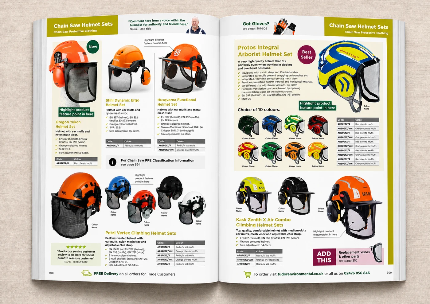
AfterThe best-seller badge and reviews gave customers the confidence to choose without needing to ask us first.
 Vern EvershedMarketing Director, Tudor Environmental
- Added an on-page customer quote for authority
- Introduced a 'Best Seller' badge to guide choice
- Added a 5-star review block for social proof
- Introduced an 'ADD THIS' cross-sell prompt

 Before
 After
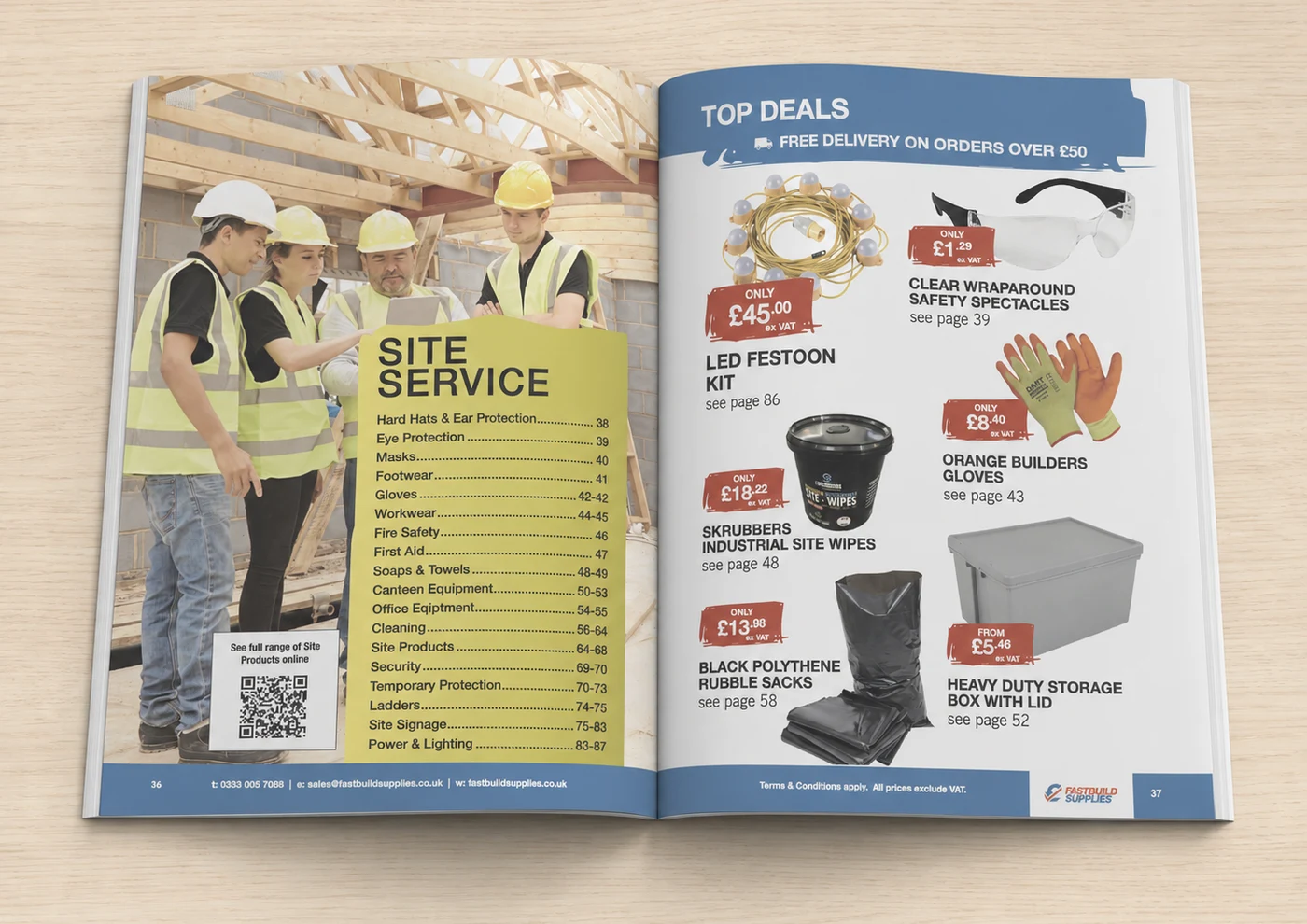
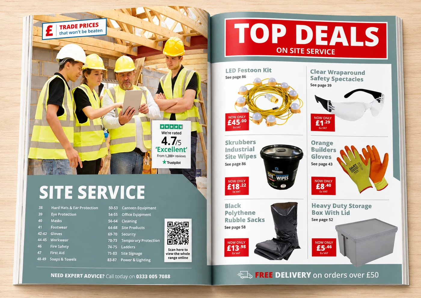
AfterPutting our review score right on the page did more for confidence than another line of copy ever could.
 Danielle BeardDigital Marketing & eCommerce Manager, Fastbuild Supplies
- Added a trust badge with a real review rating
- Made the 'Top Deals' banner bolder and more scannable
- Introduced a trade-price reassurance message
- Standardised pricing and product labels for clarity

Every one of these demos follows the same principle: prove the uplift on two real pages before asking for the rest of the catalogue.

 Before
 After
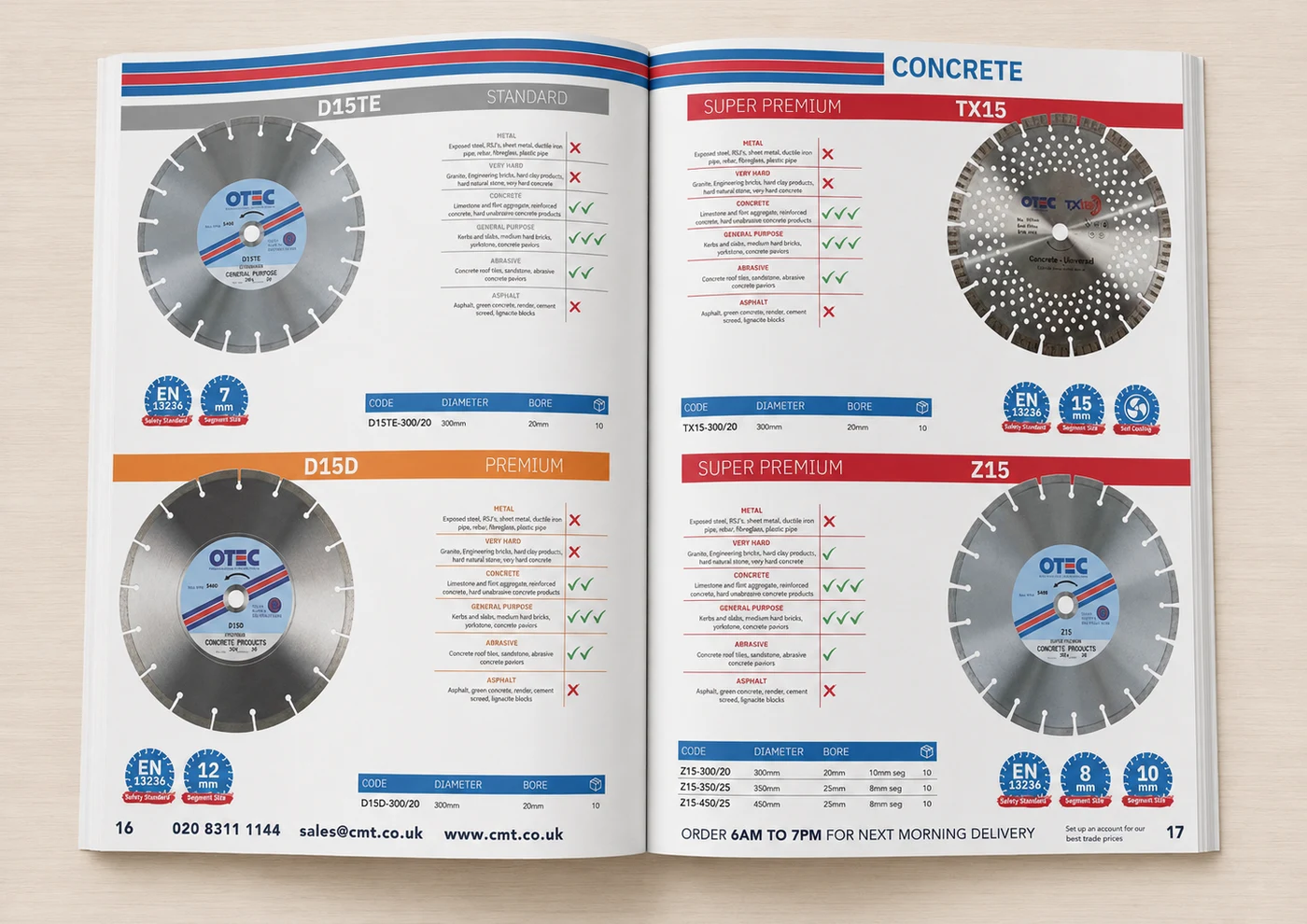
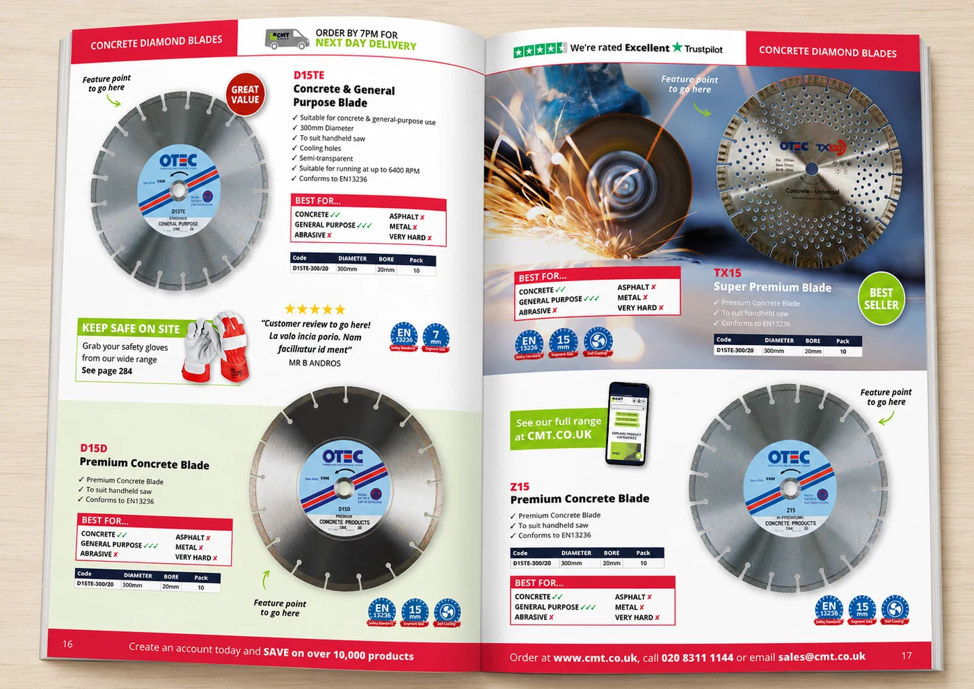
AfterThe 'Best For' panels mean customers can see at a glance which blade is right for the job, no calls needed.
 Mark LeventGroup E-Commerce & Marketing Manager, CMT Group
- Added a Trustpilot rating badge for trust
- Introduced 'Best For' guides to speed up product choice
- Added lifestyle photography to bring the product to life
- Introduced a cross-sell panel for related safety gear

 Before
 After
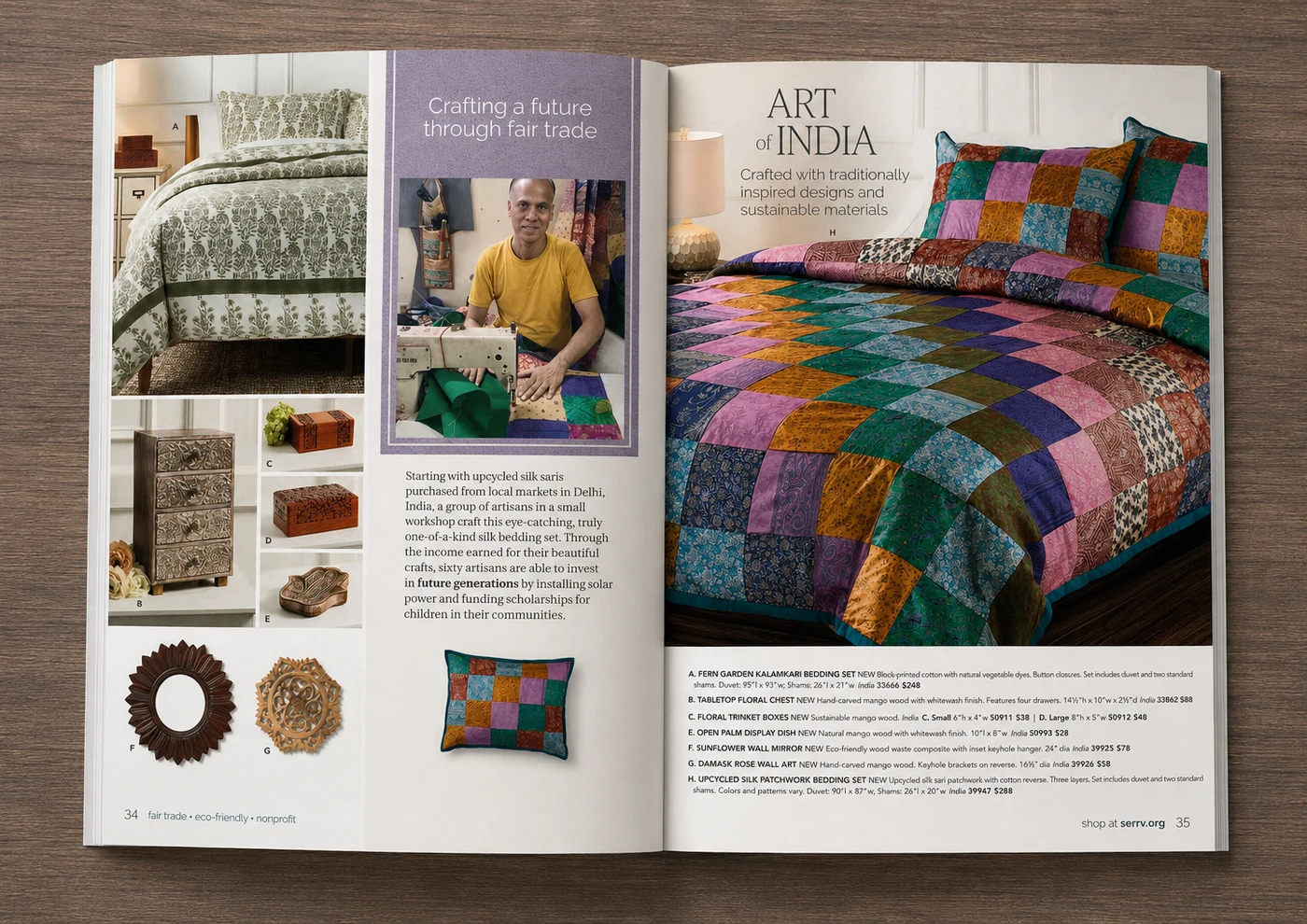
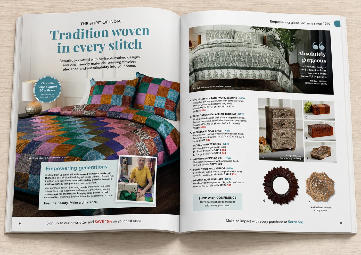
AfterPutting the impact of every sale on the page turned a product spread into a reason to buy.
 Serena SatoCEO/President, Serrv International
- Added a benefit-led headline and mission story
- Introduced a customer quote for on-page authority
- Added an impact badge tied to the brand's mission
- Added a reassurance panel near the product listings

 Before
 After
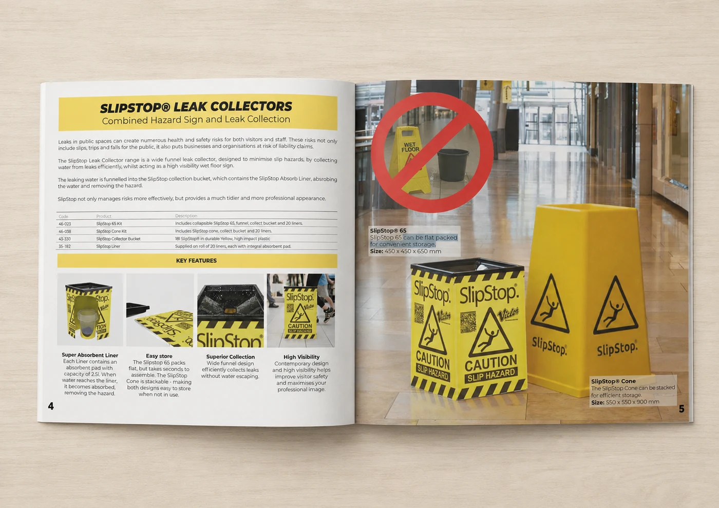
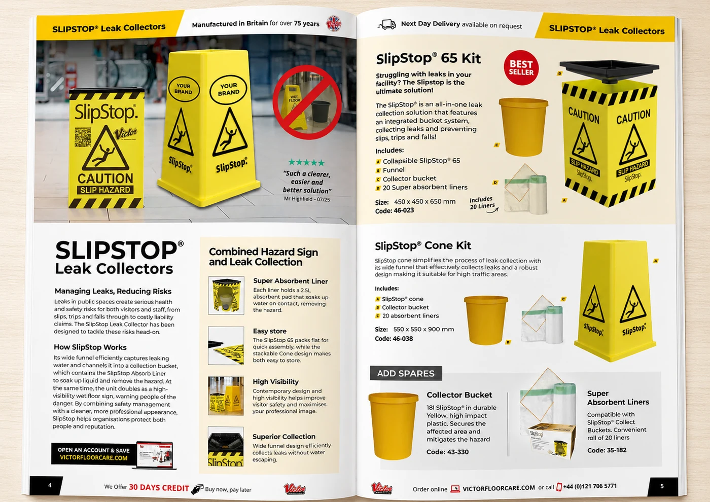
AfterLeading with the manufacturing heritage and a real review gave the page instant credibility it didn't have before.
 Edward BlackledgeManaging Director, SlipStop
- Added a trust badge (75 years manufactured in Britain)
- Introduced a 'Best Seller' badge and customer review
- Added an 'Add spares' cross-sell panel
- Restructured copy into a clearer how-it-works narrative
Giving the page a clear hero product changed how the whole spread read — it finally looked like it was selling something.

 Before
 After
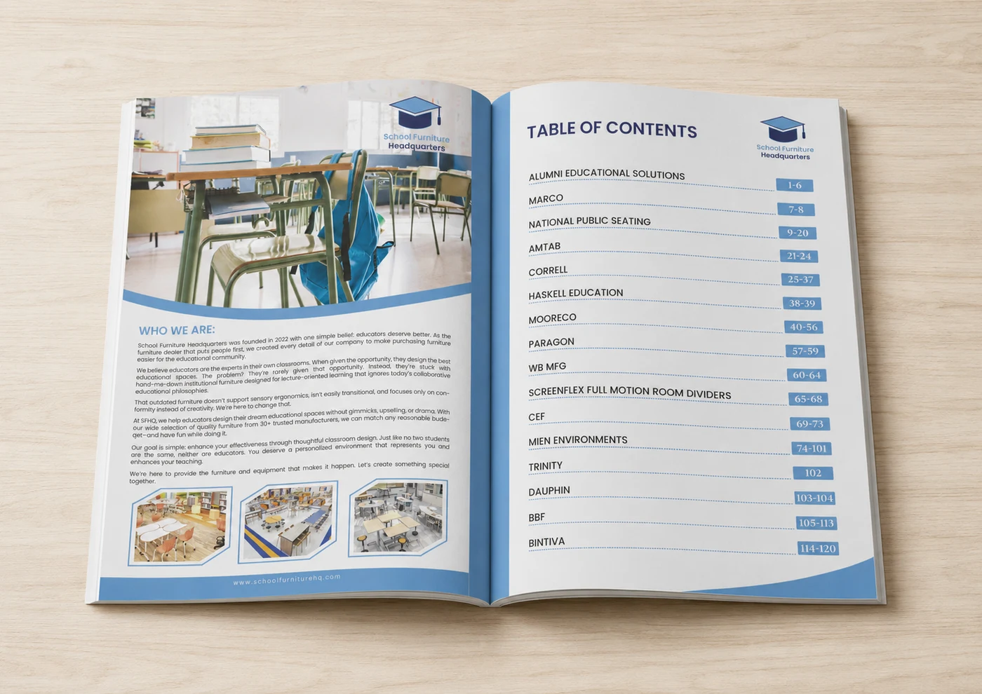
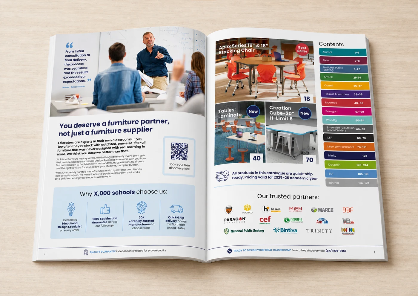
AfterFrom initial consultation to final delivery, the process was seamless and the results exceeded our expectations.
 Stephen FerreiraFounder & CEO, School Furniture Headquarters
- Added a customer quote for on-page authority
- Introduced trust badges (satisfaction guarantee, quick-ship)
- Added 'Best Seller' and 'New' product badges
- Added a QR code linking straight to a discovery call

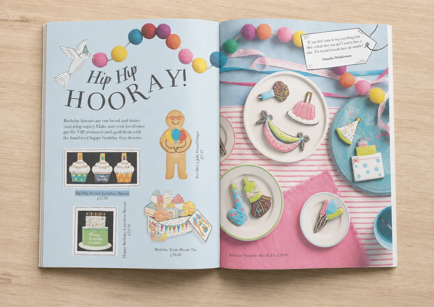 Before
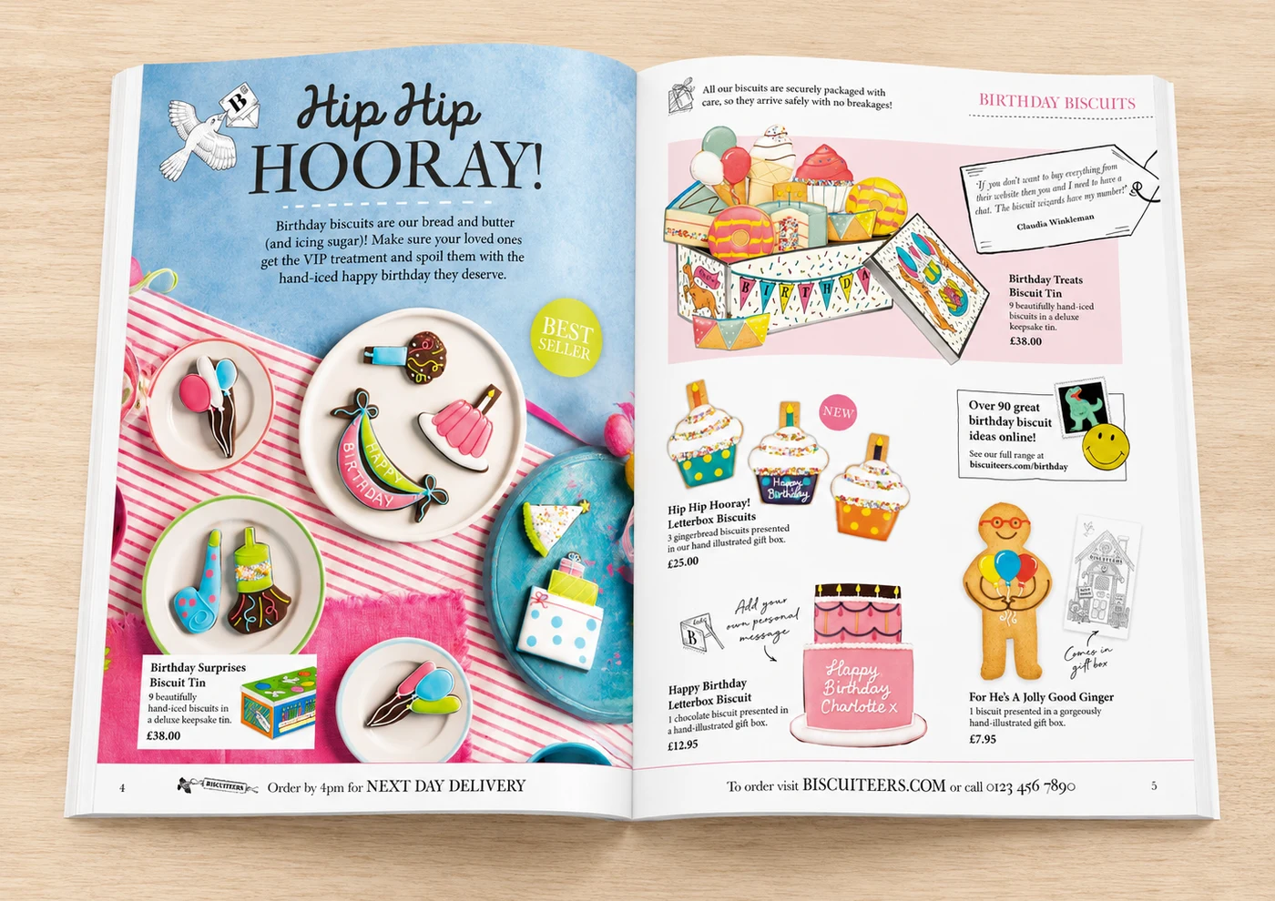 After
AfterEverything reads so much more clearly now — you can see what's new and what's popular at a glance.
 Milly FoleySenior Campaign Manager, Biscuiteers
- Added a 'Best Seller' badge to guide choice
- Introduced a delivery and packaging reassurance line
- Added a 'New' badge and an online cross-promo box
- Organised the layout into a clearer, consistent grid

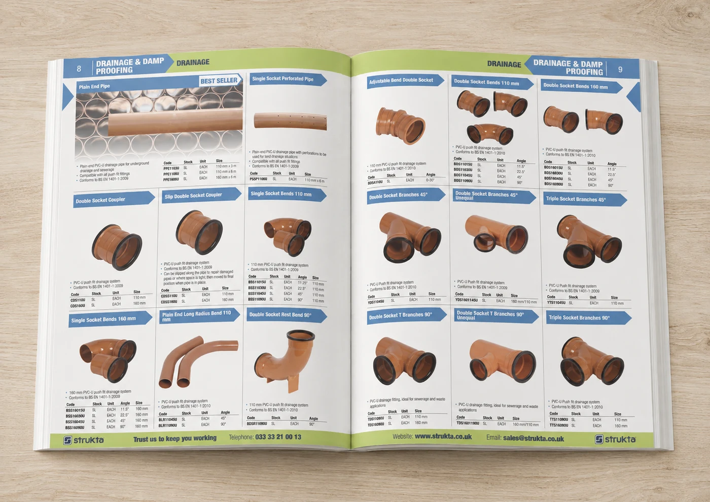 Before
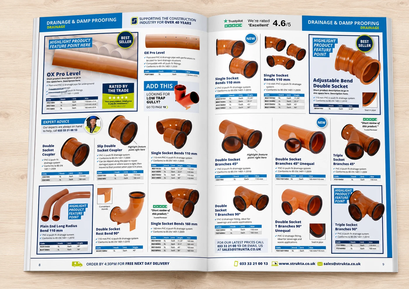 After
AfterHaving a real person and phone number right on the page makes it feel like an actual conversation, not just a catalogue.
 Tazio MitchellMarketing & Graphic Designer, Strukta Group
- Added a Trustpilot rating badge for trust
- Introduced an 'Expert Advice' contact panel
- Added 'Highlight feature' callouts to hero products
- Added an 'Add this' cross-sell prompt

The best demos don't redesign for the sake of it — they find the one change on a spread that was quietly costing the client sales.

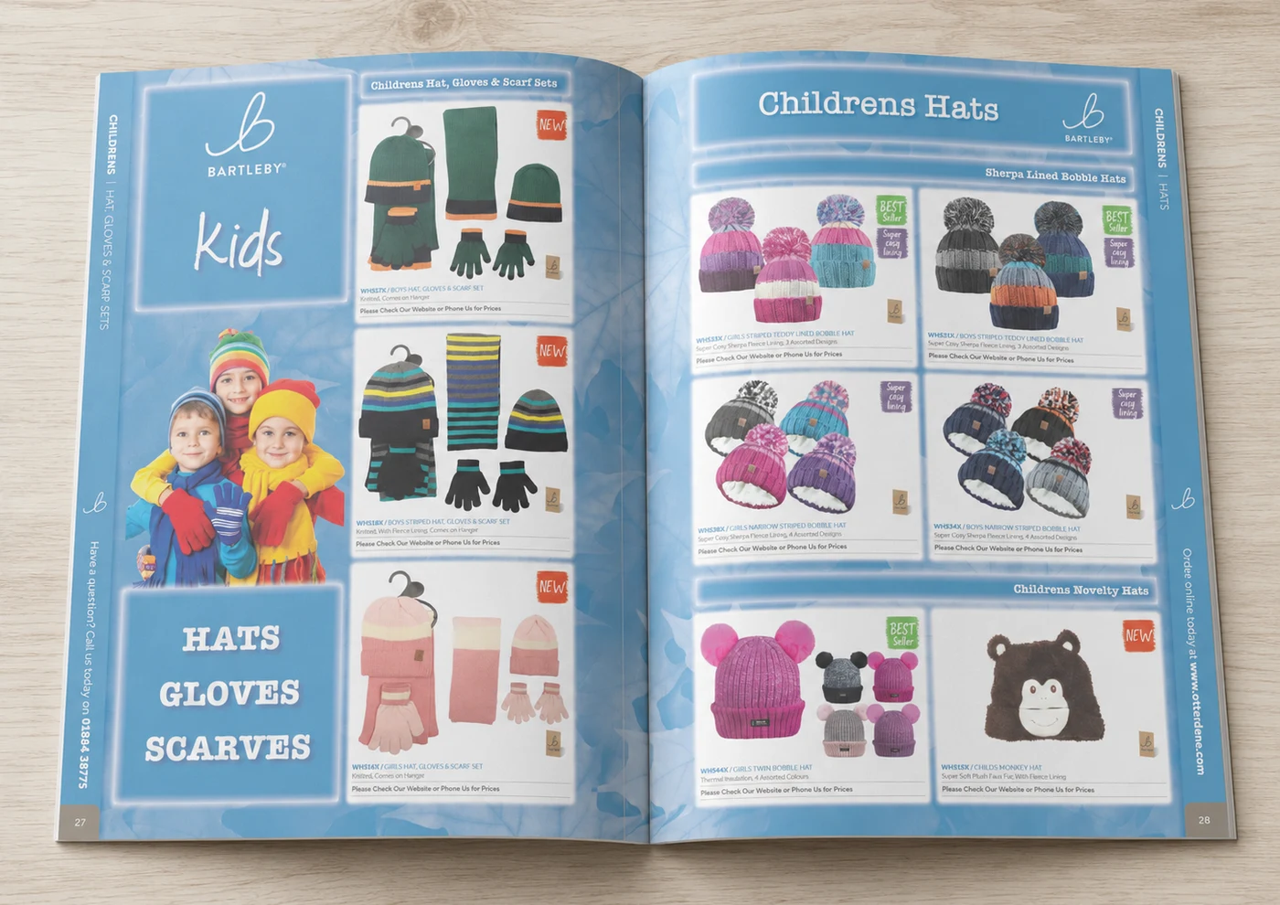 Before
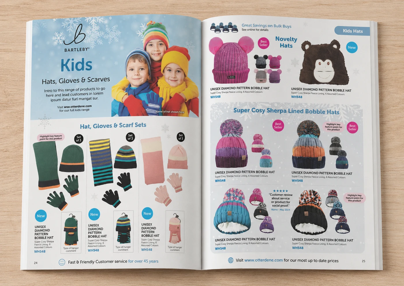 After
AfterSimplifying the grid made it so much easier to see what's new and what's actually worth buying.
 Roger ParsonDirector, Otterdene
- Added 'New' and 'Best Seller' badges throughout
- Introduced a customer review callout for social proof
- Added a bulk-buy savings cross-sell banner
- Simplified the grid for clearer product hierarchy

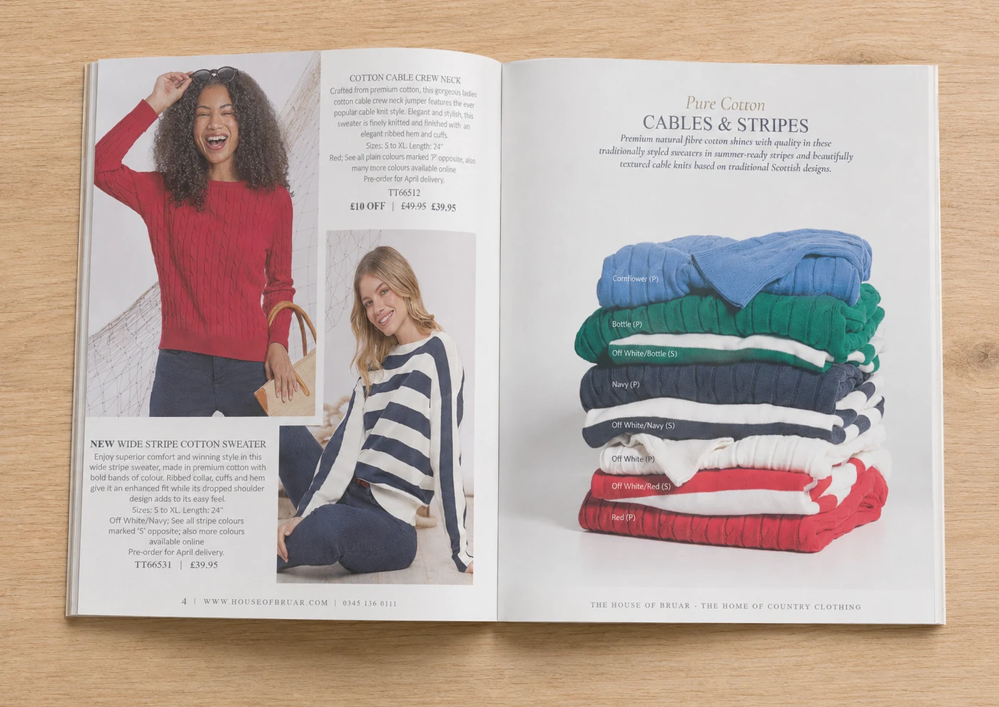 Before
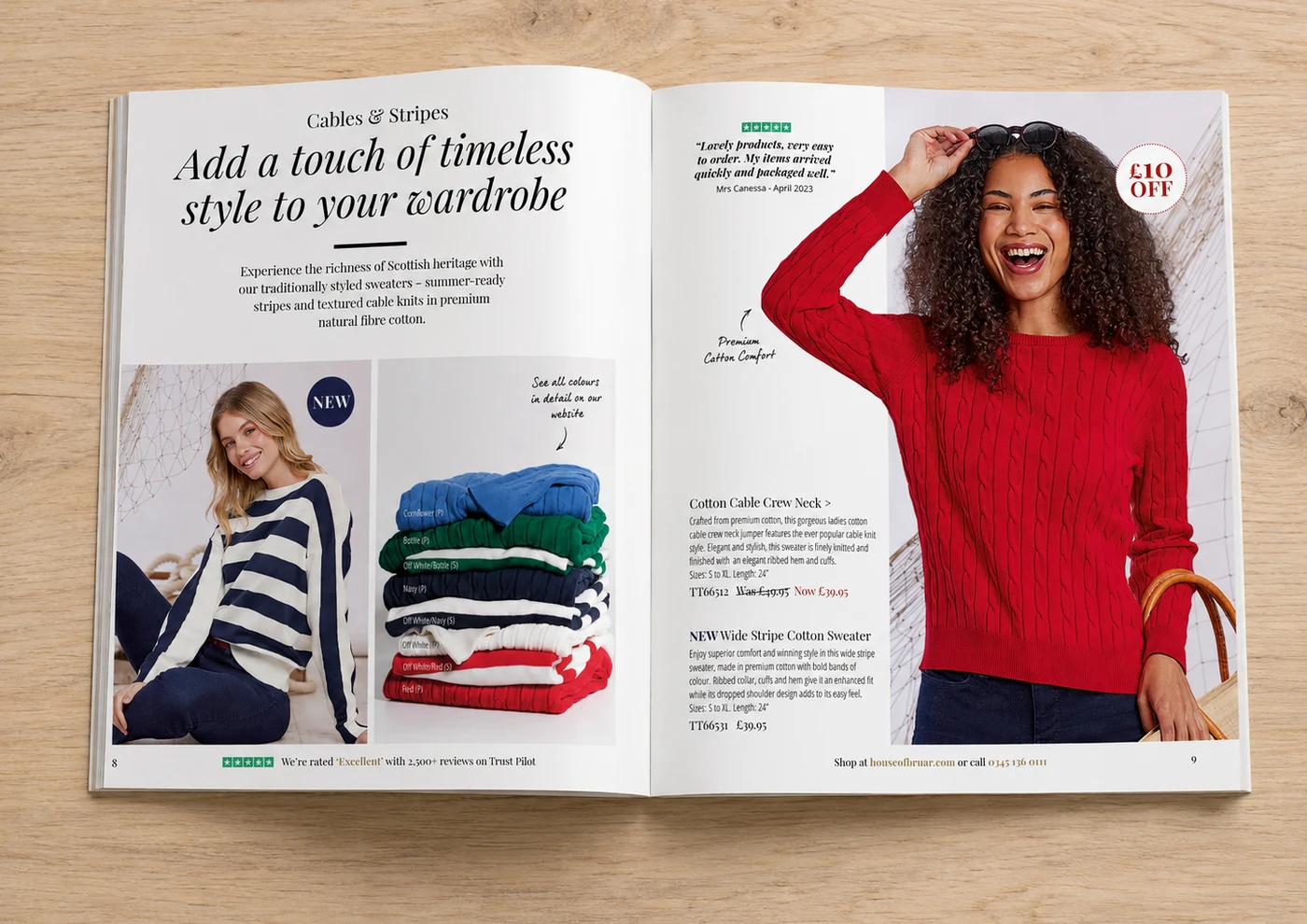 After
AfterI was very impressed with the free catalogue demo, it was much more detailed than I expected and the new designs they created using our existing catalogue as a base showed clearly how more potential could be unlocked.
 John HodgeHead of E-comm & Mail Order, House of Bruar
- Added a benefit-led headline and intro copy
- Introduced a Trustpilot rating badge and customer review
- Added a clear discount badge and was/now pricing
- Enlarged the hero product for stronger visual impact

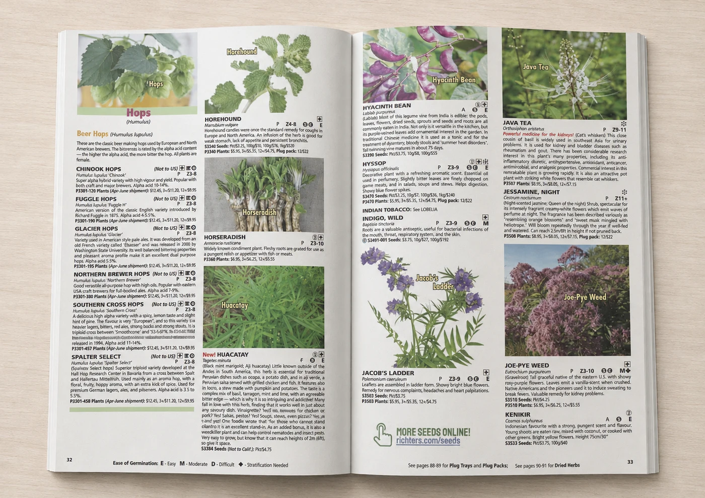 Before
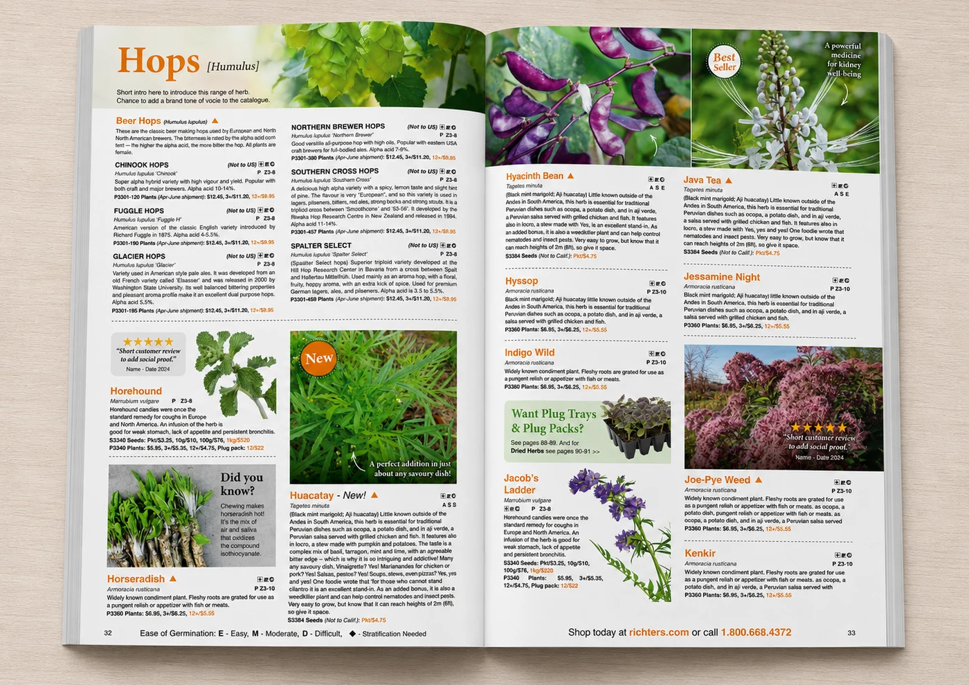 After
AfterBreaking up the page with colour and reviews made browsing so much easier — it doesn't feel like a wall of text any more.
 Kofi RichterVice President, Richters
- Added colourful section headers for easier navigation
- Introduced customer review callouts for social proof
- Added 'New' and 'Best Seller' badges
- Added a cross-sell box for related products
Putting the impact of every sale on the page turned a product spread into a reason to buy.

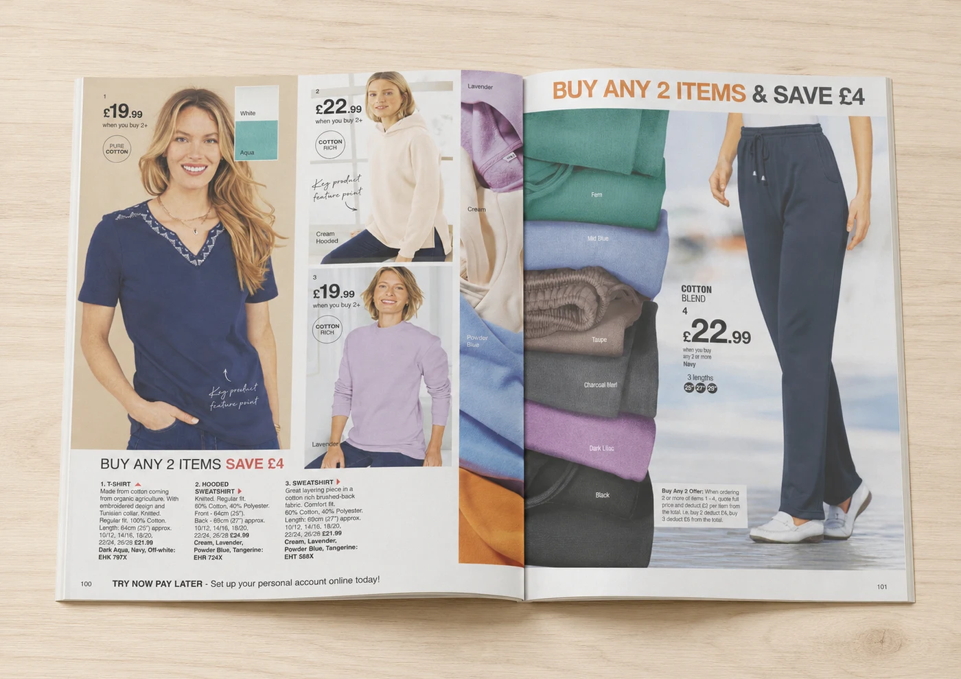 Before
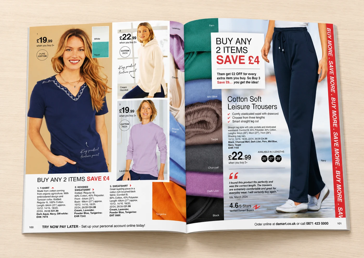 After
AfterSpelling out the extra savings for buying more made the offer click instantly instead of needing to do the maths.
 Alyson TaggartMarketing Director, Damart
- Added a clear tiered discount offer box
- Introduced a star rating and verified customer review
- Added a repeating 'Buy More, Save More' banner
- Added a tick-bullet feature list for the hero product

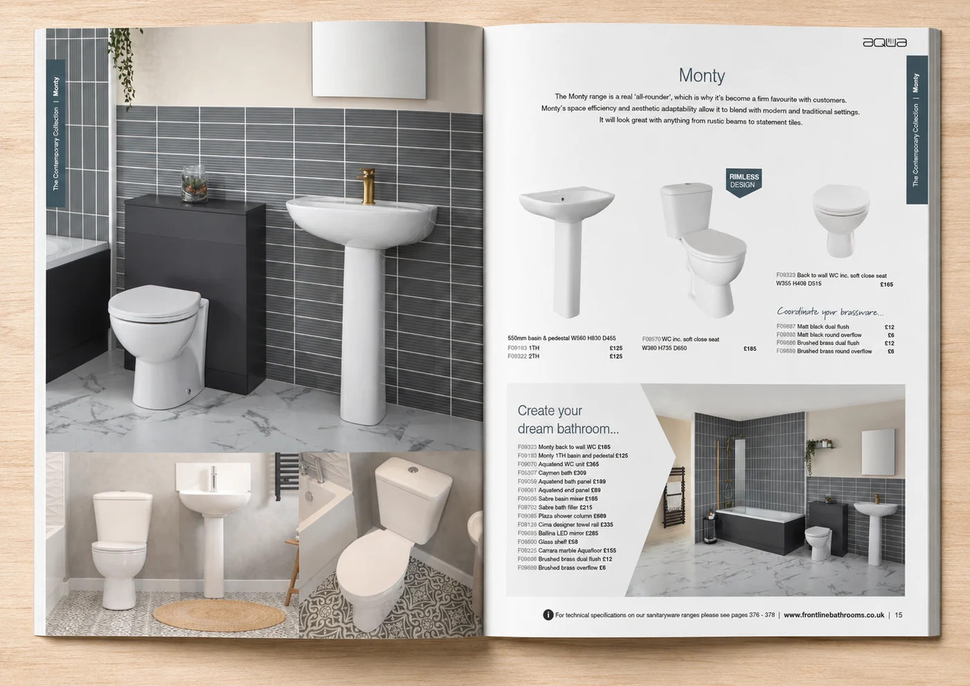 Before
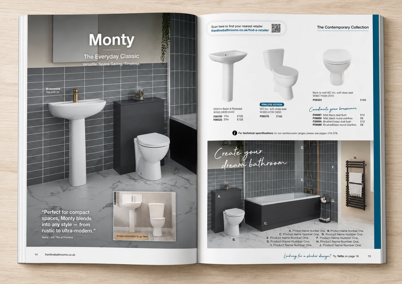 After
AfterLabelling every product in the room shot means customers can shop the whole look without flicking back and forth.
 Darren AllisonManaging Director, Frontline Bathrooms
- Added a benefit-led headline and positioning tagline
- Introduced a customer quote overlaid on the hero image
- Added a QR code linking to 'find a retailer'
- Labelled every product in the lifestyle shot for easy reference
 Before
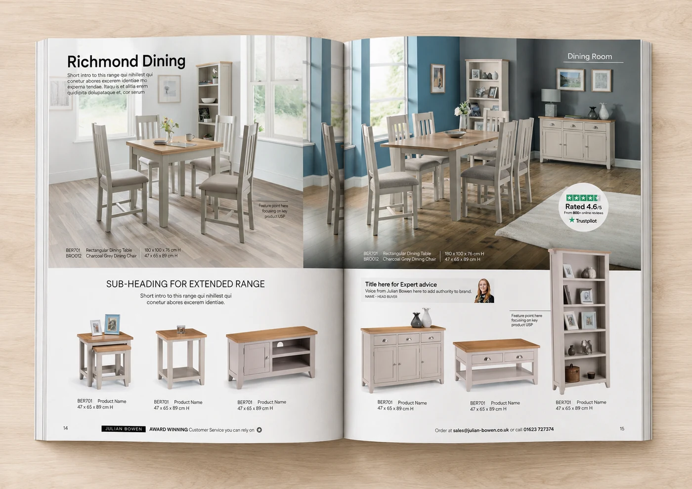 After
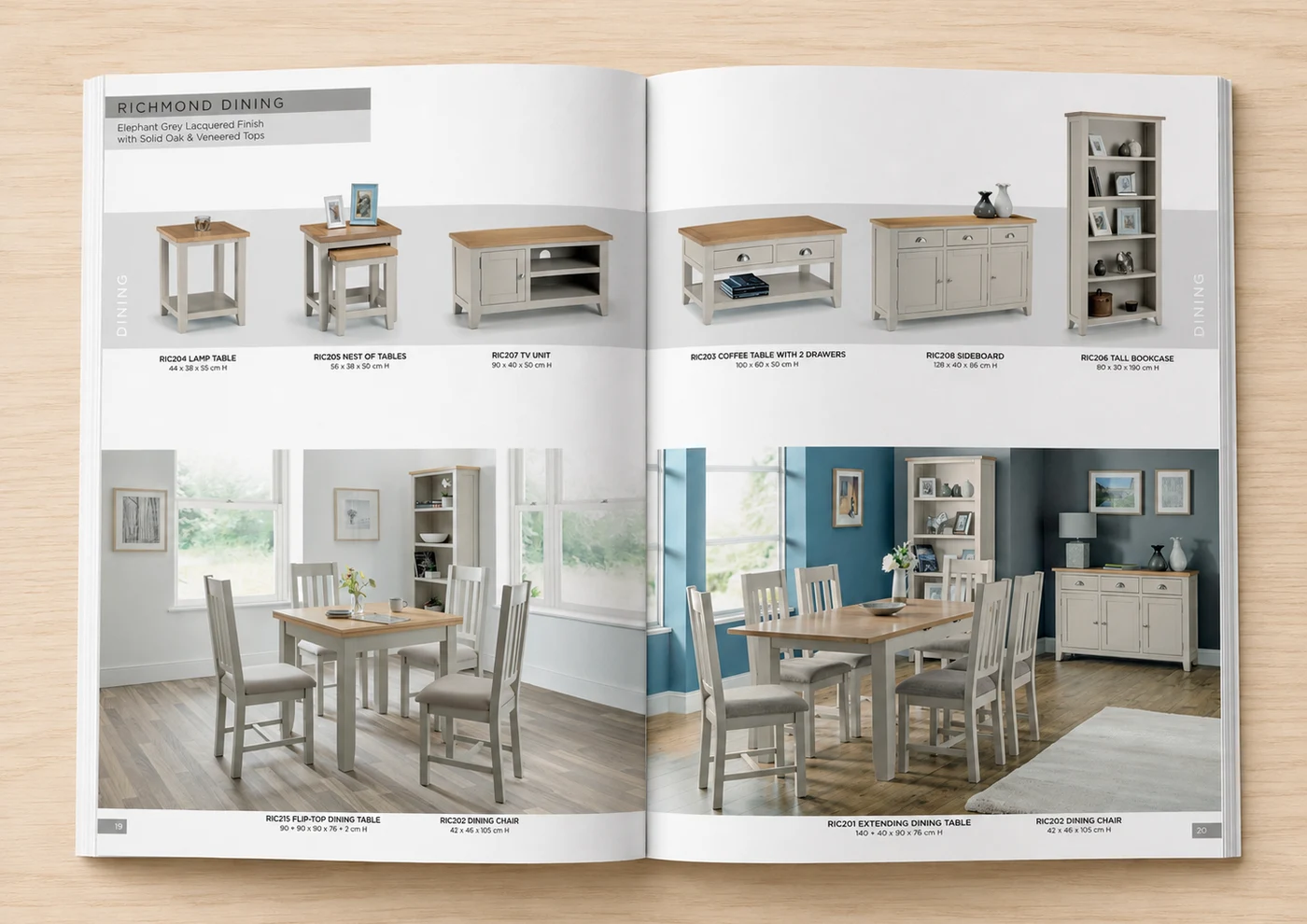
AfterHaving a real buyer's face and advice on the page makes the range feel properly recommended, not just listed.
 Preet GrewalMarketing Manager, Julian Bowen
- Added a Trustpilot rating badge for trust
- Introduced an 'Expert Advice' panel with a real buyer
- Added feature-point callouts on key products
- Added clearer sub-headings and intro copy throughout
Ready to see these improvements applied to your catalogue?
Get your free page redesign. It starts with a 20-minute call, so we learn how your business works before we redesign real pages from your catalogue. No commitment, no cost.